

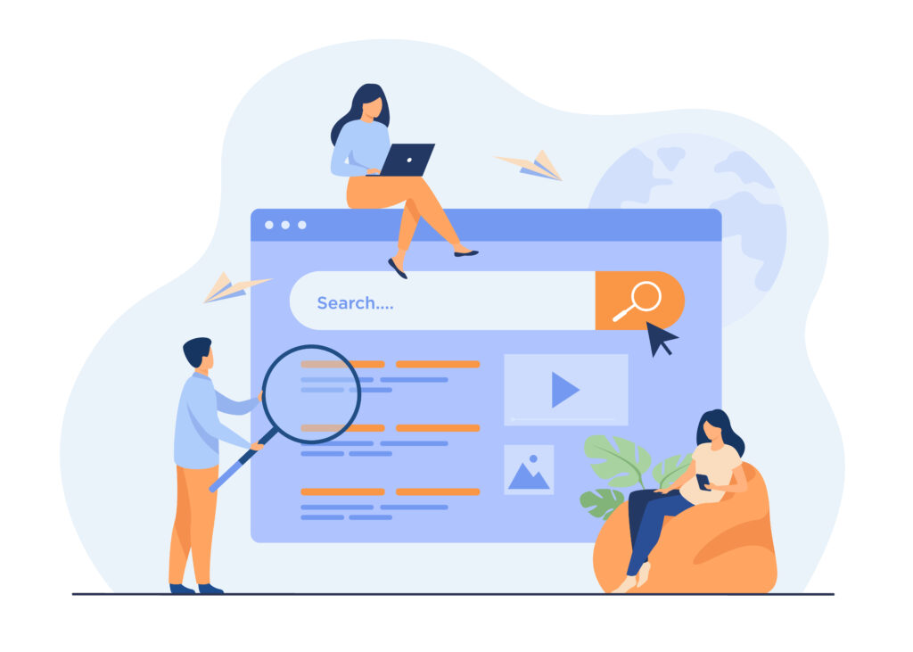
UX Describe
New website
An easier and better-resulting way to develop a job description
Time
Role
Tools
Freb. 2022 – Sep. 2022
UX Briefing
CSD Matrix
Tech Recruiters Interview
Personas
HMW
Crazy 8’s
User Flow
MoodBoard
Prototype textual content
Usability Test
Notion
Miro
Figma
Maze
Zeplin
Scenario
We realized that many professionals starting in the area of UX/ UI Design have great difficulty in entering the market, even though there are many job openings and opportunities in the area. Another point is that recruiters have also had difficulty in finding these UX professionals.
We understand this scenario as an opportunity to be explored and try to find a solution to facilitate the meeting between UX professionals and tech recruiters.
Problem Statement/Challenge
How can we create compatibility - the Match - between companies/recruiters and UX/UI Design professionals, through information?
Final Result
A platform to help the Tech Recruiter to develop job descriptions for vacancies in UX, UI and Product Design. Specific indications for each position and seniority, in order to facilitate and help the selection and hiring process. The prototype can be viewed at this link:
Learnings
Lessons
- I learned more about teamwork and how to divide tasks;
- The importance of exchanging information and understanding different points of view, this is the richness of teamwork;
- During the interview process, I learned that it is often necessary to change or adapt questions and improve the scenario to achieve better results in the research, especially in usability tests;
- In my experience, recruiting for unmoderated research was more difficult than for moderated research. Knowing how to approach the candidate and ask for their help makes it easier to commit.
Discover
DESK RESEARCH
- When receiving too many candidates, the evaluator doesn’t have as much time available to evaluate all the candidates and this process will become tiring, frustrating, stressful;
- Unpreparedness for the selection process, professionals who do not know what they are really doing in the selection process;
- Many job descriptions present requirements incompatible with the level of the professional;
USER RESEARCH
In total we interviewed, via Google Meets, 9 Junior UX Designers and 5 Tech Recruiters. After the interviews we gathered all the information collected and organized an Affinity Mapping to group similar data. This resulted in 6 main insights:
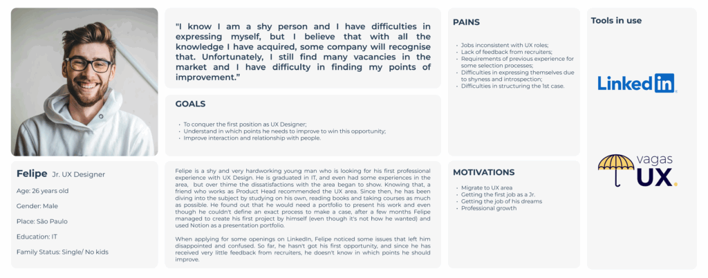
Ux Designers
OVERWHELMING REQUIREMENTS FOR JUNIOR VACANCIES
Several of our interviewees said that the list of requirements for junior vacancies is getting longer and longer. Many of these jobs require previous experience, sometimes for years.
DIFFICULTY WITH THE 1ST CASE AND PORTFOLIO
Some of the professionals commented on the difficulty in drawing up the Portfolio and how to describe the case studies.
CHALLENGES OF INTERVIEWS AND SELECTION PROCESS:
One point well highlighted by UX Design professionals was the lack of post-interview feedback.
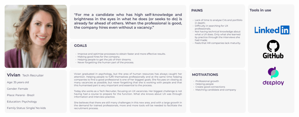
Tech Recruiters
DIFFICULTY IN FINDING QUALIFIED PROFESSIONALS
On the recruiters’ side, many highlighted the lack of preparation of junior professionals, who end up making basic mistakes. Often applying for vacancies without analysing the requirements.
TRAININGS FOR RECRUITERS
A large proportion of the recruiters interviewed have not undergone any training in the area. They learned self-taught about UX and the criteria for recruiting UX professionals.
BEING ABLE TO FILTER OUT QUALIFIED CANDIDATES
When asked about a possible solution to the search for candidates. Recruiters said they would like to be able to customise filters depending on the vacancy
COMPETITIVE ANALYSIS
Focusing on understanding the main possible competitors. We selected 3 companies for this exercise. By assessing the positive and negative aspects of all competitors, we could understand what would be improved to develop a better solution.
Positive points:
- It is possible to have interaction with recruiters and companies;
- Navigation is easy and resembles a social network;
- Very solid UI.
Negative points:
- The job search comes down to recommendations from the platform;
- Due to the large amount of information, it is sometimes difficult to find everything that the platform offers.

Positive points:
- It has a specific curator to search for internship, trainee and junior positions;
- It works as a showcase for UX designers to get a greater sense of the market and vacancies available;
- Simplified navigation that integrates with other platforms such as Linkedin
Negative points:
- It does not have recruiter interaction within the platform;
- Simplified navigation, without many options;
- No registration or any kind of customization.
Positive points:
- Intuitive navigation with multiple interactive screens;
- Well done design with a very solid visual pattern;
- Filtering done by artificial intelligence.
Negative points:
- It does not have its own profile creation;
- It does not have direct contact with the recruiter;
- It is not possible to interact with the recruiter on the platform.
On completion of the analysis we realised that Gupy is one of the most interesting competitors for our product. However, Vagas UX has a more welcoming and simple approach with its contents, which we highlight as a point to be taken into consideration.
Interesting insights:
- The targeting of which flows are best for completing recruitment;
- The readability of the important points of the product;
- Colours and types of communication with the user;
- Types of customisation of your search for a vacancy.
Our competitors have points that can be exploited, such as filtering qualified professionals for the vacancy. Possibly, these can become differentials in the product.
Define
Persona
After collecting all the information from the Discovery phase. We developed 2 personas, which represent the two audiences we are working with in this projec
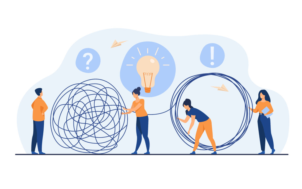
Ideation
During the creation process, we used the Crazy 8 technique to think of possible solutions. Each team member developed 8 different solutions.
We created a 2×2 Matrix to define the most interesting options. And each member could vote and prioritize the options that fit best with our problem.
We noticed that the solutions were more focused on meeting the needs of the recruiter persona.
Develop
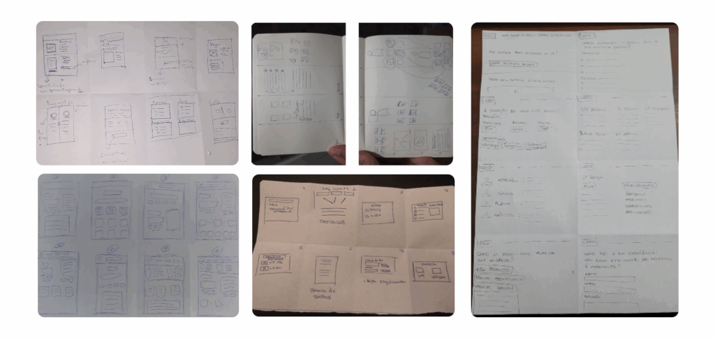
Wireframe
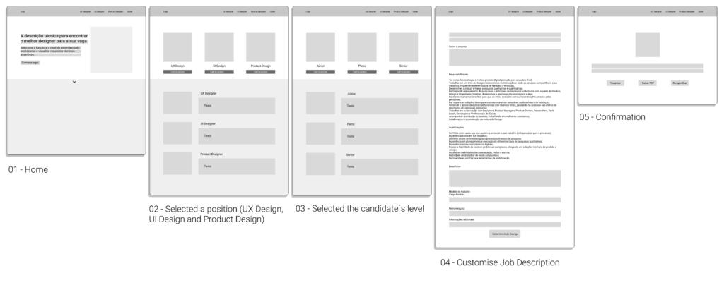
Before making the prototype, we created a sketch of the product. Thus, we were able to understand and define the 5 main screens of the user flow in Figma.
This way, it was possible to visualise the structures, functions and sessions that the solution would have.
Deliver
Project
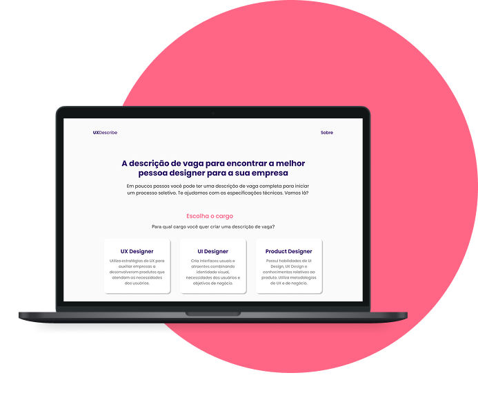
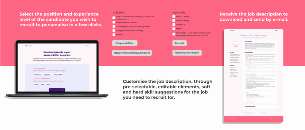
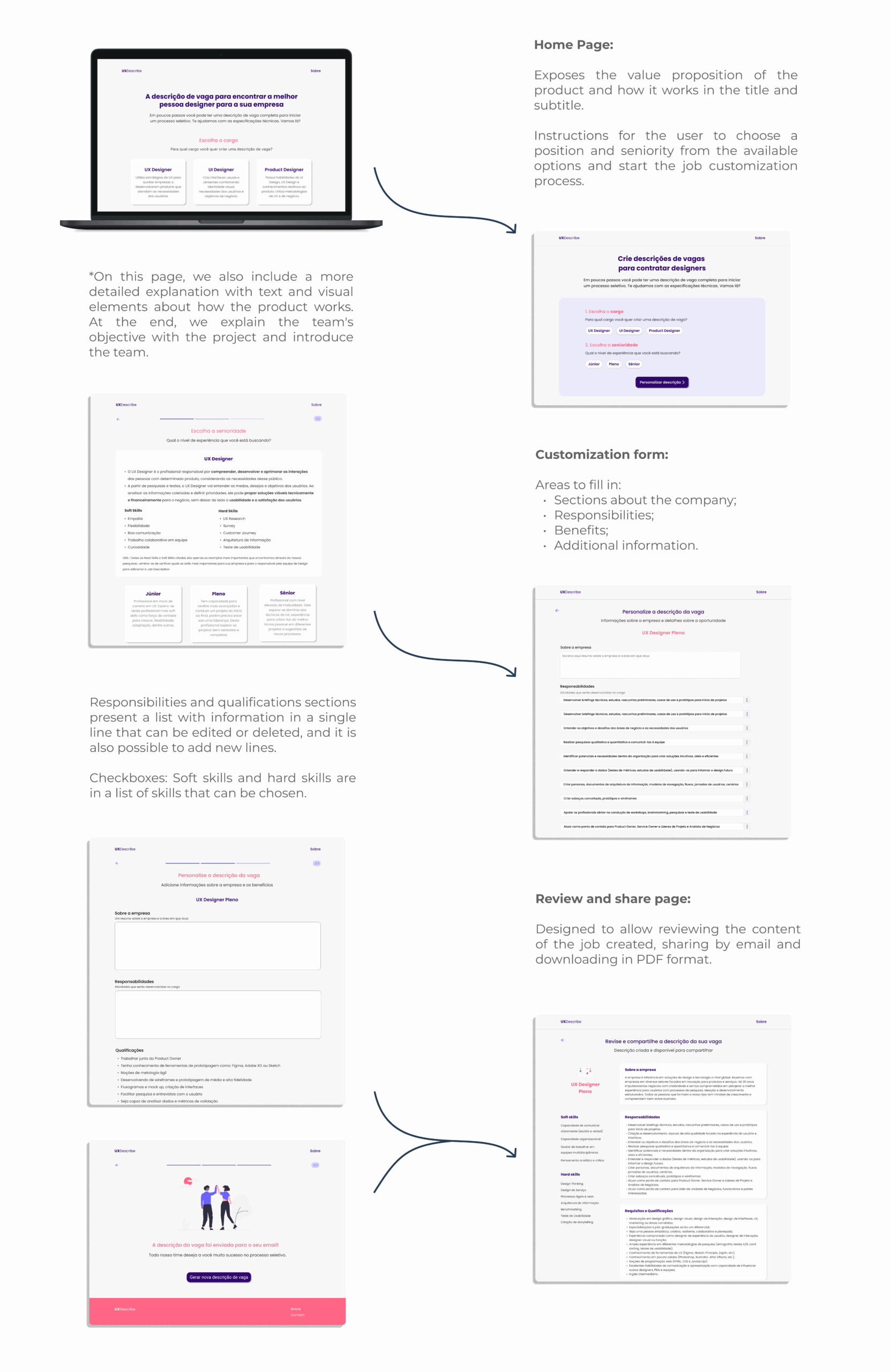
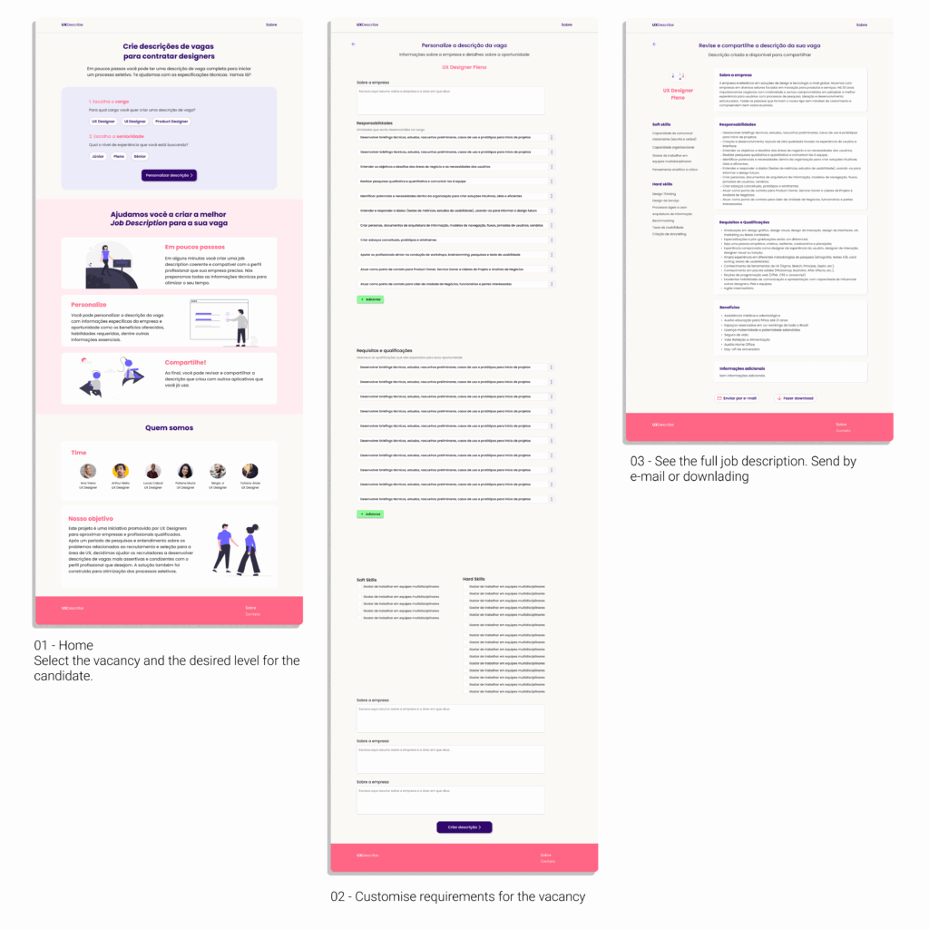
The solution we have developed was designed with recruitment professionals in mind. A platform where it was possible to create job descriptions for UX, UI and Product Design vacancies, according to the level of experience of the desired professional.
Within the platform the recruiter fills in a form, which has technical information previously available and editable. The recruiter can also select the requirements, the hard skills and the soft skills that the candidate needs to present. It is still possible to personalise whatever is necessary. Finally, the complete description can be sent by e-mail or downloaded.
For this first stage a Medium Fidelity Prototype was developed. In order to develop the idea and test it.
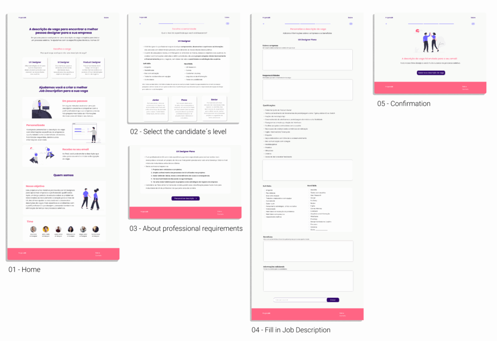
Usability Test + Improvement
We carried out an usability testing with a Medium- Fidelity-Prototype. Through the results, it was identified that changes to the prototype were needed to improve usability and facilitate use. These changes can be seen below:
Hand off
The Handoff is the stage where UX Designers need to organize and send all relevant information (notes, details, research, visual interfaces, etc.) about the project to developers in order to implement and develop the final product.
Zeplin was the program used to organize the handoff. All the prototype pages were imported from Figma to Zeplin and grouped by sections, namely: Home Page, Forms (UX Designer, UI Designer, and Product Designer), and Review (UX Designer, UI Designer, and Product Designer). To make it easier to understand the flow of the pages, an example user flow was created from the home page, through the Junior UX Designer customization page, to the review and sharing page of the job description created.
This stage can be seen at the link: Hand off

© 2025 Ana UX Design — Made with ♥ and tea