Context Problem Process Discover Define Solution Impact Reflections
UX Research Redesign Accessibility Solo Project

Road of Hope:
a website that finally matched the mission.

A nonprofit helping refugees in Amsterdam had a website that was getting in the way of its own cause — unintuitive navigation, broken flows, no way to donate easily. I redesigned it from scratch, end-to-end.

6+
New countries reached
7
User interviews
↑ Funding
New invitations & donations
Solo
Research + Design + Dev
Timeline
Aug 2023 – Dec 2024
My Role
UX Designer · Researcher · Developer
Tools
Figma · WordPress · HTML/CSS
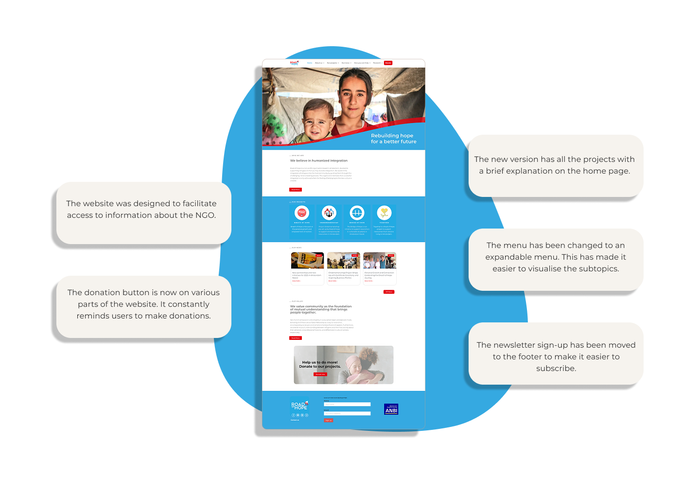
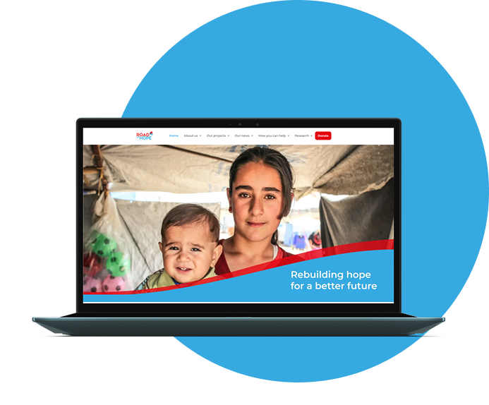
Road of Hope final result
🌍

A cause worth fighting for.
A website that wasn't helping.

Road of Hope is a nonprofit based in Amsterdam dedicated to supporting refugees on their journey to integration. Their mission is powerful — but their digital presence was holding them back.

The website had outdated information, a confusing navigation structure, no easy way to donate, and content that didn't tell the organisation's story. Potential volunteers and donors were landing on the site and leaving without taking action.

I was brought in as a solo designer and developer, responsible for the full project — from initial research all the way through to launch and maintenance.
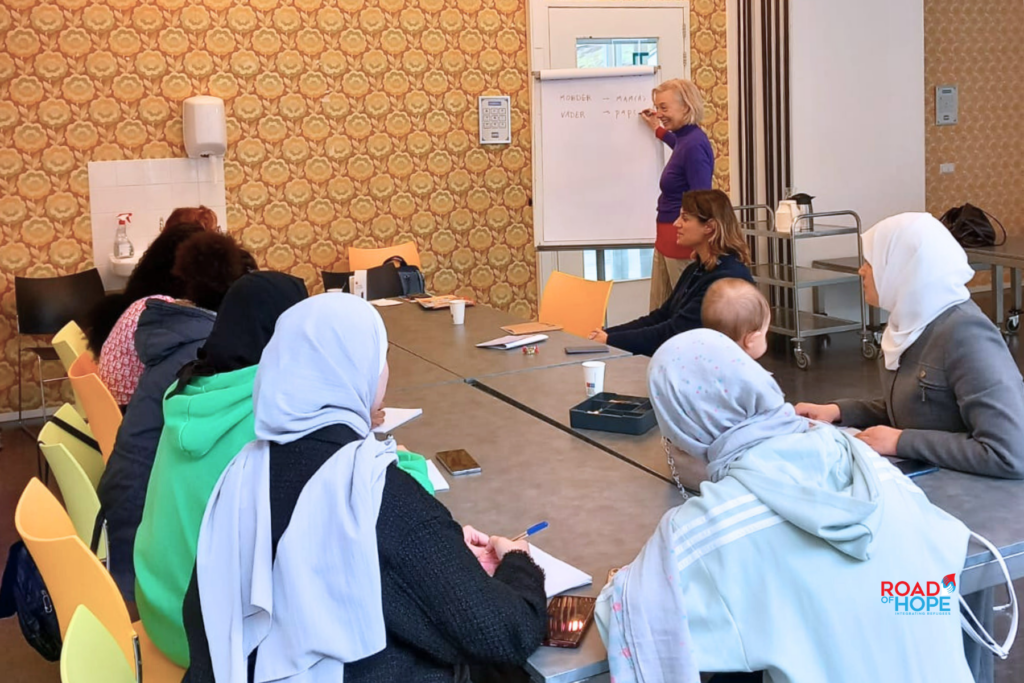
Road of Hope context
📌
"How can we increase the visibility of the organisation and its work through the information provided on the Road of Hope website?"

The brief wasn't just about aesthetics. It was about fixing real user experience failures that were costing the NGO volunteers, donors, and visibility. Before designing anything, I needed to understand what exactly was broken and why.

🧭
Confusing navigation
The main menu required clicking a button to reach a submenu on another page — users couldn't see what was available at a glance.
💸
No easy way to donate
The donation tab only showed a bank IBAN. There was no PayPal, no button, no guided flow — just an account number and silence.
🙋
Volunteer form was broken
The volunteer tab said "contact us" with a non-functional link. Users who wanted to help had no clear path to do so.
📝
Outdated content
Old photos, grammatical errors, and projects that no longer existed were creating a trust problem with new visitors.
📖
No storytelling
The language was flat and institutional. The human stories that made Road of Hope special were completely absent from the site.
🦶
Broken footer
Icons and the logo in the footer weren't clickable, making it impossible for users to navigate or access social media from there.

From heuristics to shipped product.

01
Discover
Heuristic analysis · 7 user interviews · Usability testing
02
Define
Competitive analysis · Problem framing · Hypothesis mapping
03
Develop
IA redesign · New user flows · Layout ideation
04
Deliver
Figma prototype → WordPress build → Live launch

Listening to the people who tried to help.

I started with a heuristic analysis, mapping the site against Nielsen's 10 usability principles. This gave me a list of concrete problems to validate with real users.

Next, I recruited 7 participants matching the profile of people the organisation wanted to reach — people interested in humanitarian causes, whether or not they knew Road of Hope already.

Each session combined a qualitative interview with a live usability test on the existing site. I asked them to try to donate, sign up as a volunteer, and find information about ongoing projects.

The results were clear: users were motivated to help, but the website was stopping them at every turn.

Key finding from interviews
"I wanted to donate but I didn't trust that my payment would work — there was just an IBAN and nothing else."
Interview results
📊

What the competition got right (and wrong).

I analysed 4 organisations with similar missions to Road of Hope. The pattern was consistent: most lacked data on their projects, used overwhelming amounts of text, and had difficult donation flows.

This gave me three clear differentiation opportunities: an intuitive user flow, storytelling language that creates engagement, and data that shows the real impact of the work.

Competitive analysis
🔍

Fixing the flows. Telling the story.

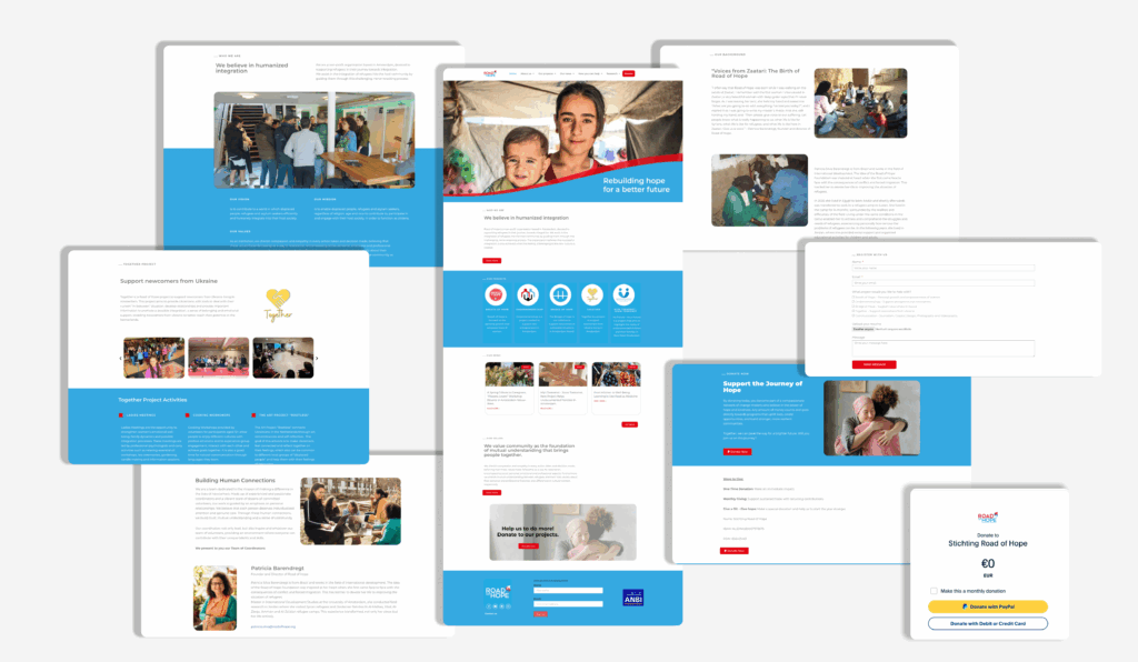
The redesign addressed every identified problem. Navigation was reorganised so the full menu was visible at a glance, with submenus opening inline.

A PayPal donation button was added in multiple locations across the site, making it possible to contribute in seconds. A volunteer registration form was built from scratch, with fields for personal info, preferred project, and a resume upload.

The language was rewritten with a storytelling focus — "our people, our story, our work" — to humanise the organisation and connect with visitors emotionally. Old photos were replaced with images that showed real impact.

I also handled the technical implementation in WordPress, institutional email setup, and ongoing maintenance — a reminder that design work often extends well beyond the prototype.

Final result overview
Final website screenshots
🖥️

Results that went beyond the brief.

The redesigned website exceeded the original goals. Beyond improved usability, it created tangible new opportunities for the organisation.

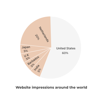
↑ Visibility
Significant increase in clicks and impressions after relaunch
New funding
New donation flow and clearer UX led to new funding invitations and event appearances
Impressions data
📈

What this project taught me.

01
Design work often goes beyond the screen. I ended up setting up institutional emails, managing file storage, and advising on legal/government requirements. A holistic approach is essential.
02
Time and task management matter enormously in solo projects. Without a team to share the load, prioritisation becomes a design skill in itself.
03
Presentation quality affects trust. Simple grammatical errors can undermine an organisation's credibility. Content quality is part of the UX.
04
Back up everything, always. My computer was stolen mid-project. I lost part of my work. File management is not optional — it's professional practice.
Next project

UX Career — International Research Study

401 voices. 25 conversations. A mixed-methods research study on what it actually takes to build a UX career abroad.

See case study →
UX Career